paul 11,988 Posted April 26, 2010 So, i'm sure by now you'll notice the new banner FAR before you even notice this thread. So opinions on it. Throw them out. Share this post Link to post Share on other sites
Tyralak 12,068 Posted April 26, 2010 I like it. (But then again, I gave the OK to put it up. ) Anyone else with any opinions? Share this post Link to post Share on other sites
paul 11,988 Posted April 27, 2010 *sighs* can we get serious opinions please not raycav stupidity? thank you. Share this post Link to post Share on other sites
Superanna 0 Posted April 27, 2010 Sony is stopping floppy production! Now where will i keep all my fonts for my K-pro?! Share this post Link to post Share on other sites
Afishymeadow 534 Posted April 27, 2010 Like it! The new banner's Share this post Link to post Share on other sites
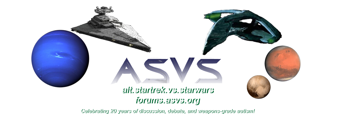
Tyralak 12,068 Posted April 27, 2010 A couple of people have mentioned that the 7 in 1997 is partially obscured by the ISD. Share this post Link to post Share on other sites
paul 11,988 Posted April 27, 2010 well i'm not listening till people comment more Share this post Link to post Share on other sites
enigma 521 Posted April 27, 2010 A couple of people have mentioned that the 7 in 1997 is partially obscured by the ISD. Yup. You need to shorten the second line a bit. Share this post Link to post Share on other sites
enigma 521 Posted April 27, 2010 well i'm not listening till people comment more You don't need to listen. You don't read with your ears. Do you? Share this post Link to post Share on other sites
enigma 521 Posted April 27, 2010 Free Speech Sci-Fi Community should be to the right of the ISD or at least of a stronger colour. Share this post Link to post Share on other sites
paul 11,988 Posted April 27, 2010 Yup. You need to shorten the second line a bit. Bleh fine fine You don't need to listen. You don't read with your ears. Do you? ...Shaddap >< Free Speech Sci-Fi Community should be to the right of the ISD or at least of a stronger colour. Any further right it throws the banner way off for other projects (not to mention enlarges it for no reason). A stronger color is the best bet any suggestions? Share this post Link to post Share on other sites
Tyralak 12,068 Posted April 27, 2010 Same color as the other text? Or is that too bright? Share this post Link to post Share on other sites
paul 11,988 Posted April 27, 2010 Same color as the other text? Or is that too bright? If it's the same color as the text it doesn't show up it has to be a dark color. Share this post Link to post Share on other sites
enigma 521 Posted April 27, 2010 If it's the same color as the text it doesn't show up it has to be a dark color. Actually it needs to be brighter like yellow or a lighter red. Too dark and it will blend with the black background. Or maybe match the colour of "ASVS". It is a bright green. Share this post Link to post Share on other sites
paul 11,988 Posted April 27, 2010 Actually it needs to be brighter like yellow or a lighter red. Too dark and it will blend with the black background. Or maybe match the colour of "ASVS". It is a bright green. Already tried the bright green it just blends with the destroyer. I'll go some red color and see how that turns out. Share this post Link to post Share on other sites
Tyralak 12,068 Posted April 27, 2010 If it doesn't clash with the light theme. The Gothic theme wouldn't have any issues with it. I would say try blue, but that might have issues with the light theme as well. Share this post Link to post Share on other sites
Praeothmin 532 Posted April 27, 2010 I like it, though I preferred the old ISD image better... Share this post Link to post Share on other sites
Khas 12,158 Posted April 27, 2010 This banner is the opposite of . Which is to say, Share this post Link to post Share on other sites
Mirah 0 Posted April 27, 2010 I think its cool. I wish I could see the full ships, is that what I call them? See, I don't know enough to comment. : ) Plus I never like to comment on another person's artwork. Also I would proably need to see the old banner again just to compare. But really they both look fine to me. I kind of like the green. Share this post Link to post Share on other sites
Tyralak 12,068 Posted April 28, 2010 lol I think it's cute we named this board Main Engineering. That makes me laugh my ass off for some reason. Well RayCav, if you bothered to show up more than once a month, you might notice when things change. Share this post Link to post Share on other sites
Ali-Sama 5 Posted April 29, 2010 I like it. The warbird is a bit blurry. Share this post Link to post Share on other sites
Tyralak 12,068 Posted April 29, 2010 Have you checked both the gothic and light colored theme? Share this post Link to post Share on other sites